Pages
▼
Wednesday, December 17, 2014
visual journal draft
This project was very fun and let me use my imagination.The first one with the Christmas topic was fun but in the end it just looked all crazy and unorganized. My favorite part was curling the bows and and adding the ribbon to it. It really framed the whole page except the page was not that great. Having the teddy bear see through was not the best idea cause it just looked like a big brown blob. But it was fun putting all the different Christmas colors and wrapping paper on the background. My favorite was the summer page. I love this one because I put a bunch of bright summer colors in the background to make it pop. I also love this one because I didn't go to overboard with it. It looks more neat and organized so it looked nicer. My favorite part is probably the part with the sunglasses and the beach going through them with the bright orange kinda as the mouth. I also loved the colors of the ocean cause it was nail polish and the beach mad of fabric. It took me a while to think of my ideas but it sure turned out to be a great creative experience.
Monday, December 1, 2014
clay and colored pencil project
Monday, November 10, 2014
colored pencil, chalk, and oil pastel project
This project was more difficult than I thought it was going to be. The chalk was my least favorite project to do because it smeared everywhere and looked sloppy. It was harder than the other projects to get the direction of the mint but it was the easiest to get the value through. This is because I would smear the two colors together with my finger to let them blend better. I was surprised with the colored pencils because I usually don't like using them. I don't like how they make the object have stray likes and not just one color. Coloring the lollipop helped me find a way to make the object colors collide. I also really liked using the white colored pencil because it helped make the colors blend better. I am most proud of the Jolly Rancher I made. I think I did a great job with the value on the candy piece and the side of the wrapper before the yellow part started. The oil pastel was also easy to use because it blended the value in a unique way. I liked this use of coloring because the candy looked like one big peice that was colored together.
Tuesday, October 14, 2014
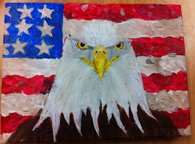
Jasper Johns Project
I had the artist, Jasper Johns, and I decided to paint like him because he was very unique. He always had an American flag in his artwork and painted very thickly and spotchily (random strokes everywhere). I thought I did a very good job of replicating my artist with the flag because there are thick strokes randomly everywhere and there are still some white spots on the page because it is not a super detailed or perfectionist type of work. I also glued splotches of newspaper everywhere in the background to make the painting have more texture and make it look more dirty and messy like Jasper's. The hardest part of this piece for me was the eagle. Drawing it wasn't as hard as making sure I have the right value in the right places. Also it was hard to paint because the eagle is not actually just plane white, it is dirty in some places and is darker around the eyes. Overall I was very proud and happy with how the project turned out and I shocked myself with my capabilities.
Wednesday, September 24, 2014
perspective project
I really loved trying to figure out what I was going to draw and taking the pictures of the eno. It turned out a lot better than I thought and I even shocked myself with the turnout. I had a hard time drawing the legs and trying to color it with the right value. I also thought I did a good job with the perspective of the picture. The eno had a separate vanishing point and then there were two other points on the side. This drawing is also personal to me because I took the picture in my backyard and i'm happy how it turned out looking just like the picture.
.jpg)


.JPG)